


 How do I know this? Well, I know because we, as design nerds, all have one thing in common: we design things. Therefore, this nerdiness can, on occasion, spill over from its usual place in the process of creating to actually become the creation itself. Such products as this Photoshop interface magnet set and the fact that it is currently out of stock by the maker tell me I'm not the only one whose endorphins did a happy dance at the sight of such a witty, ingenious creation. I guess it's a way to allow the processes that already infuse life as a designer to actually spill over into the rest of experienced life. If only the windows could actually edit the images this way... I mean, who doesn't want their refrigerator front transformed into the screen they look at 24/7 anyway? This is further evident in the creation of "The Creative Sleep" pillow collection (featured above), where you can make yours an Adobe home by replicating your computer dashboard's rainbow-colored Creative Suite on a couch or bed. All you need now is a mini plush cursor arrow, no? (Although, any true design nerd can instantly spot that these are outdated, given that they are obviously from CS3 and haven't been updated to reflect the new CS4 shortcuts' gray lettering instead of white.)
 I worked as production designer on the film and offered up my apartment for our location. As far as dressing our "set" (aka my kitchen) goes, I didn't do a whole lot. I knew most of the film would be in close up, but I tried to rearrange things on the counter in order to make them a bit more visually interesting. The thing I learned the most during this part of the process is that my roommates and I have A LOT of cereal. Like three boxes a person. Ridiculous.
 My role really came into play with all of our props, where I basically functioned as an "inanimate object wrangler." I made the faces for all of our "actors" (except for Brittany, that is) and nudged them along, snapshot by snapshot, to bring them to life. The real production design work for this project was figuring out the logistics of moving the objects down the counter, but a quick reunion with my trustworthy friend, duct tape, quickly met this challenge with a solution. We also blew the yokes out of the eggs so that they would be lighter and more easily suspended without breaking.
 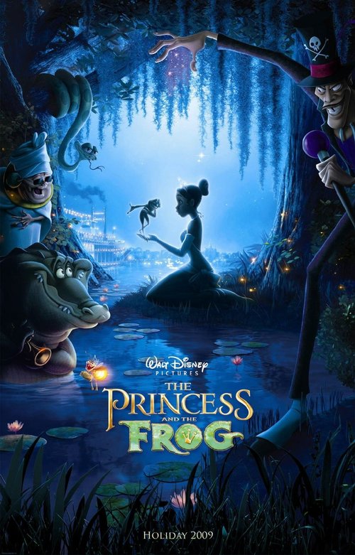 Thanks to the film symposium class here at USC, I had the privilege of viewing Disney's The Princess and the Frog last week, nearly three weeks before it makes its theatrical release. While my critical studies-trained mind recognized that there were problems with the film, my escapist, borderline Disney-obsessed self loved every minute of it. Movies like this film make me question the relationship between critical thought and entertainment value because it's difficult trying to acknowledge the problems while still maintaining my extremely enthusiastic response to this film. The return to hand-drawn animation and a story laden with new Disney songs to add to my epic playlist, right alongside the likes of "Be Our Guest" and "A Whole New World," would have had to include devastatingly horrendous problems for me to leave the theater unhappy. However, I did recognize its problems, and though I feel unworthy in critical circles to say that I like a film with obvious flaws, I'd be lying if I said I didn't smile more during this film than any other I've seen this fall.
Create a skit. Ready, begin.
In the sixth grade, I signed up to join a creative problem-solving team at my school through the organization Destination Imagination (try saying that five times fast), and looking back, I don’t even know what led me to do it. The cliché would be to say it was fate that led me to that audition, but honestly, I think it was mostly because my friends were doing it. (It was middle school, after all.) However, I don’t think I’d say I joined out of an attempt to keep up with the popular crowd or to gain a certain social status. I mean, the name alone ought to tell you that people weren’t exactly giving up their pom-poms or cleats to be a part of something with the word “imagination” in the title, let alone in a rhyming format. For whatever reason, though, that didn’t bother me.
I say “for whatever reason,” but, in truth, I didn’t have a lot to lose. I mean, I wasn’t necessarily unpopular, but I wasn't exactly turning heads as I shuffled down the hallway either. I was just a really shy and quiet kid, struggling through the years where your worth seemed to be determined by how many boys asked you out (zero) and whether or not your pair of Birkenstocks was real (nope). Becoming a part of something that could potentially (and did) lead me to dress up as a turban-wearing, Russian accent-speaking fortune teller was definitely not a move that was going to help me socially...

In Destination Imagination, students are divided into teams with five to seven members, and then each team creates a skit to function as their solution to one of five challenges in different categories ranging from technical design to improvisation. That year, my team’s challenge was entitled “Instant Pudding Improv,” and it was our job to stir up a six-minute skit whose ingredients included an historical figure, a famous place or event, and an eccentric character. The catch to this recipe (or best ingredient) was that the entire skit had to be cooked up on the day of competition, thirty minutes before we served it out, hot and fresh. No time to let anything thaw, no waiting for it to set in the refrigerator. Prior to competition, we could prepare and research various historical figures and famous events from a list, but all our efforts were only allowed to pre-heat until that moment at t minus thirty minutes before performance. Then, once we knew which ingredients we’d be using in our theatrical dish, we could set to work whipping up props, costumes, and set pieces out of ten pre-determined items like a shoebox and mailing labels. Sound appetizing? To indulge myself in the extended metaphor a bit longer, I ate it up.
Very quickly, I no longer saw all these “rules” as obstacles, but instead as key tools that actually gave me more freedom in creating a story. What if the person with asthma were the Big Bad Wolf? Should he be attempting to huff and puff and blow the Great Wall down? Could we make the wall out of cardboard? What if the Wolf ended up being self-conscious about needing an inhaler? Could we make a Chinese New Year Dragon out of paper and an umbrella? Should an Asian Humpty Dumpty sit on the wall? Once the gears started turning, the story could end up in Istanbul or Neverland, it could involve pirates and lobsters, or a man who loved to do the twist for kings and queens. A leprechaun could get lost and go in search of his rainbow home or oversized pieces of fruit constructed out of trash bags and newspaper could form a conga line across the stage, exuberantly led by the Chiquita Banana Lady.
The cyclone of creative energy consumed everything in me, so much so that even my self-consciousness was blown off its hinges entirely. In the excitement of a good idea, no one could hold me back in trying to express and share it, even if that meant dancing across the stage in a skirt made of broom bristles or coloring my face green with a marker to become a troll. (Luckily, I recruited someone else to do this, and I was able to remain a non-alien skin tone. It was washable…) I would’ve never sung in front of anyone as myself, but in order to communicate the great wit of Grecian gods and goddesses singing songs about Greece to the tune of songs from Grease, you bet I did it. It was embarrassingly off-key and cheesy, but I sure did it.
With imagination and lots of duct tape, anything was possible. Anything, that is, provided it could be accomplished before the judge given privy to this magical creative whirlwind uttered the words your adrenaline and brainwaves had been whirling toward ever since the countdown of preparation began-- “Time’s Up!”
 Despite the fact that I grew up in Alabama in the heart of the Bible Belt, church was not a part of my family’s weekly routine and faith was never really talked about. All I knew about Christianity when I was young was that there was Jesus, and there was God, and there was something about a cross, but every fact outside of that was blurred. As I got older and got more curious, though, I began my own investigation through the Bible, vigorously reading, searching, and devouring every word in my pursuit of answers. It says in Matthew 7:7 to “ask and it will be given to you; seek and you will find; knock and the door will be opened to you,” and for the most part, I found this to be wholly true. However, after much inquiry, there was one aspect of Christianity that continued to elude complete comprehension for me and was therefore somewhat unsettling in its inability to be fully grasped in its intricacies-- the act of baptism. I carried this curiosity with me into college, where I was given the opportunity to delve further into its exploration through a digital photography project focused on capturing my personal sublime.
  Like many others, I was highly anticipating the release of Spike Jonze's take on the classic children's book Where the Wild Things Are. I had been intrigued by its visual design from the beginning, to the point that I think it was mostly the unique look of all the trailers and posters that got me interested in seeing the film in the first place. As a designer, I was also incredibly excited (perhaps to a nerdy degree) by the fact that a blog was created to track the many forms of inspiration, encompassing various media, that influenced the making of the film. Going through it really heightened my expectations for the film’s release, because it gave a unique behind-the-scenes perspective of the planning process and how research images, music, and design became a part of the visual communication that the filmmakers used to achieve such a unified aesthetic among all the departments.
Therefore, not surprisingly, I loved the film aesthetically. It had such a distinct visual tone, with its gray, neutral, muted colors that perfectly reflected the mood of the story. I like the fact that the aesthetic choices reflected that it was about creatures who were upset, angry, confused, hurt, lonely, underappreciated, etc., despite the fact that it was a children’s story which typically use bright, saturated colors, regardless of content. I also appreciated the creativity in the set design, particularly that of the large, Death Star-esque fort and the wild things’ individual huts. It was so imaginative that it completely reinforced the idea of being in the other kingdom that was distinct from the real world that had been left behind. While the topography of the land was still somewhat familiar, the details were a reminder that this was not just any forest, any lake, or any desert.
However, despite its sophisticated visual style, I felt like the film’s story was somewhat underdeveloped and left me less than satisfied. While I liked it as a children’s book, I think it could have been better adapted for the screen in order to fill the feature-length running time. I think it could have been a great thirty-minute movie, but there just wasn’t enough to the story to keep me engaged for over an hour. I really wanted to like it, but I found myself constantly fighting boredom.
Perhaps this is a result of the fact that the film seemed to be a little confused about who its audience was intended to be. While it was a children’s story, I feel like the film was made more for adults, particularly based on its visual style, music selection, and overall mood. On the other hand, a lot of the dialogue seemed crafted more for five year olds, which got a bit exhausting to hear as an adult because it was all so juvenile. I realize that there is a subtext to all the simplicity and that all of the wild things’ struggles are universally relatable, but I think there was a lot of missed opportunity to add more subtext or depth so that the story would be more entertaining to an older audience as well. After loving the story so much growing up, maybe I had just expected it to have grown up a bit with me…

For example, clicking on this image:
leads to this one:
which then leads to this one:

which leads to...
As a graphic designer, I find this site incredibly useful in the process of image research for projects because I can easily hone in on a particular mood, look, or style when collecting images to inspire a similar mood in my own piece. However, past research, I know that I have easily spent hours recreationally perusing the site because of the manner in which one image leads so easily to another, creating a nice, linked flow through image files. I have literally had to give myself time limits in order to keep myself from spending too much time on this website.
However, my one criticism of the site is that I wish it contained more information about the visual content it presents. While it is convenient that the layout is not complicated by copious amounts of text, it would be helpful in some cases to have a bit of information on the page without having to hyperlink to the source. Sometimes I would like to know more about a certain picture's context, since that can layer an image with a lot more meaning than it may contain self-sufficiently. In this way it is a unique type of artistic forum since most of the images are separated from their context, source, and artist by at least one degree.
Overall, though, I feel like ffffound.com's formatting supports its content appropriately for its purpose. The way it tosses images into a sort of visual gumbo gives users license to approach it as a site to inspire new designs and enable a certain recycling of visual media. Therefore, if you are in search of the perfect picture to support a new idea or just a visually and creatively stimulating way to spend the next hour, look no further.

